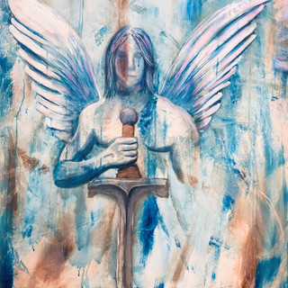
My strength is in light and shadow. I have to work at the rest.
 Marc Davies
- Jan 7, 2021
- 3 min read

Shortly after I sold my very first painting my mom told me that I showed a natural talent for drawing when I was a child. I had no idea she thought this until I was over 40 years old! I've always enjoyed looking at art and can easily be moved and carried away by a piece. In my early twenties I sat down with a friend of mine who is an incredible portrait artist. He showed me some tips that he used and I started drawing on a regular basis. I still love getting out my drawing pencils and smelling the earthy lead and the fresh cut wood. Sometimes I open my pencil case just to breath in that smell.
The picture above is an early drawing I did around the year 2000. It shows my natural talent for creating differences between dark and light and the blending of the two. At the time I didn't even know what "value" was. Value defines how light or dark a given color or hue can be. That's my primary artistic gifting. I have to work at the rest of it. Especially when it comes to color and getting the right perspective.
When I start a piece I will typically draw out the basic idea using my aromatic pencils. I use reference images to ensure that what I'm trying to create looks like what it's intended to. Sometimes I can convince my kids to model for me. They seem to enjoy this and you'd never knew that the model for some of my work was a child. Using reference images helps me to get the right perspective too. The biggest benefit of using a reference image is that a deer will look like a deer if I base my concept on an actual deer. I recently tried to draw a deer for a friend from memory and it ended up looking like a weird cow-dog creature. We both laughed at the new mythical creature I had created. I suppose being an artist and having people ask me to draw things for them must be like a comedian being asked to be funny for someone they just met. "You're a comedian? Be funny for me." I suppose it could work to my benefit if I answer them by saying, "I'll draw something for you if you're ready for a laugh."
Once I have the right reference image and a solid concept, I start working on the background of the painting. Before I do this I think about what colors I want to use for the main image. I like to use the same colors in the background of a piece as the main image will use. It gives the painting a pleasing aesthetic. However, I've learned that the wrong color combination can be a disastrous distraction.
As I start working on the color of a piece I spend a lot of time imagining different colors on the piece. Then I go to my trusty friend, the color wheel. I've learned that if I want my work to look professional I can either make everything black and white or use a color wheel. A color wheel is a basic art tool that uses red, yellow, and blue (the three primary colors) in mixtures of each other called secondary and tertiary colors. Colors that sit directly across from each other usually clash. Colors are also grouped into warmer colors (yellows and reds) and cooler colors (blues and greens). I've studied color more than anything else I use on a regular basis because it can make or break a painting. Below is a sample color wheel that take the three primary colors and makes a color wheel with 12 different hues.
I tend to use color fairly sparingly, but am continuing to explore new and vibrant combinations and expanding my usage of color. As I gain confidence I anticipate that my work will become more and more colorful.


Comments